Miller Columns
Section titled “ Design”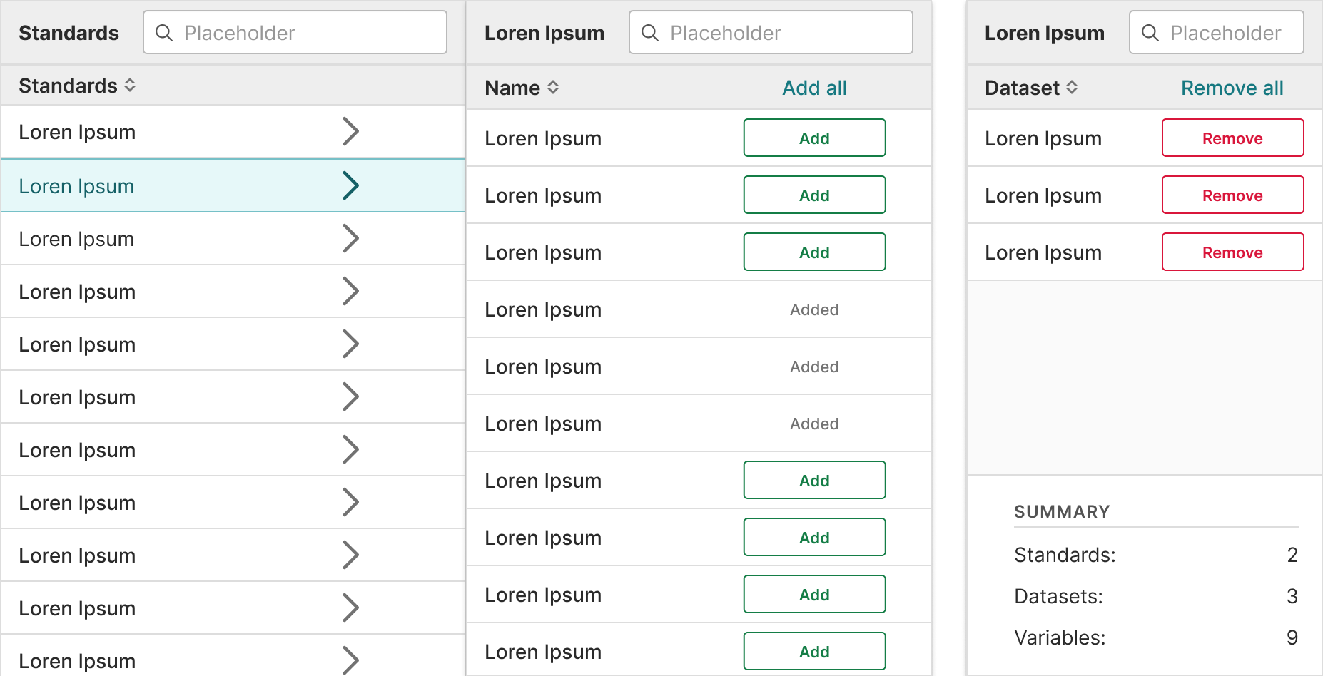
In Practice
Section titled “ In Practice”Miller columns should:
Section titled “Miller columns should:”- Show values across multiple categories and measures.
- Allow for filtering and ordering when comparison is not a priority.
- Help users visualize and scan many values from an entire data set.
- Help user find other values in the data hierarchy through links.
- Use only relevant text or data so that it’s easy to understand.
- Wrap instead of truncate content. This is because if row titles start with the same word, they’ll all appear the same when truncated.
Alignment
Section titled “Alignment”- Column content types are built into the component props so the following alignment rules are followed:
- Numerical = right aligned
- Textual data = left aligned
- Icons = center align
- Align headers with their related data
Actions column
Section titled “Actions column”- Use links when there are one or two actions.
- Use an overflow menu, trigger by an ellipse icon (), when there are more than two actions.
- Place the column all the way to the right.
Content guidelines
Section titled “ Content guidelines”Headers should:
- Be informative and descriptive
- Be concise and scannable
- Include units of measurement so they aren’t repeated throughout the columns
- Use sentence case (first word capitalized, rest lowercase)
Column content should:
- Be concise and scannable
- Not include units of measurement (put those in the headers)
- Use sentence case (first word capitalized, rest lowercase)
Decimals
Section titled “Decimals”Keep decimals consistent. For example, don’t use 3 decimals in one row and 2 in others.
Accessibility
Section titled “ Accessibility”Structure
Section titled “Structure”- Native HTML tables provide a large amount of structural information to screen reader users. Users who rely on screen readers can navigate tables and identify relationships between data cells
tdand headersthusing keys specific to their screen reader. - Sortable tables use the aria-sort attribute to convey which columns are sortable (and in what direction). They also use aria-label on sorting buttons to convey what activating the button will do.
Keyboard support
Section titled “Keyboard support”Sorting controls for tables are implemented with native HTML buttons.
- Give buttons keyboard focus with the tab key (or shift + tab when tabbing backwards)
- Activate buttons with the enter/return and space keys
Design resources
Section titled “ Design resources”When designing tables in Certara’s Design Library, use plugin Table Creator