
Table
Use certara-table to easily build out static tables with support for search, sort, and pagination. This component is built off of Grid.js.
As a cautionary note, this component is best used for static table. If the data within the table changes frequently (by user action, or async request, etc.) this component may not be the most performant. This is due to the way Grid.js re-renders the table when the data changes. In order to change the data in a cell, the entire table needs to be re-rendered to calculate the height and width of the table and all of its cells. The best use case for this component is a drop in replacement for datatables.
| Study | Project | Licenses | Actions |
|---|---|---|---|
| ABC-123 | ABC | 2 | |
| ABC-456 | ABC | 10 | |
| DEF-123 | DEF | 102 |
| Item | Quantity | Price |
|---|---|---|
| Widget A | 5 | $25.00 |
| Widget B | 3 | $15.00 |
Actions
Section titled “Actions”It’s possible to add actions to the table, such as print, copy, and download, by utilizing the right-actions slot. The certara-table component comes equipped with printTable, copyTableToClipboard, and downloadTable methods that can be called to perform these common actions. Below is a simple example of how these actions can be added to the table in React, although the same principles apply to other frameworks, including vanilla javascript.
import {useRef} from 'react';import {CertaraButton, CertaraTable} from '@certara/certara-ui-react';import {faker} from '@faker-js/faker';
const data = Array(3)  .fill()  .map(() => ({    id: faker.string.uuid(),    name: faker.person.fullName(),    address: faker.location.streetAddress(),    city: faker.location.city(),    state: faker.location.state(),  }));
const columns = [  {    name: 'Name',    data: (row) => row.name,    search: true,    copy: true,    download: true,  },  {    name: 'Address',    data: (row) => row.address,    search: true,    copy: true,    download: true,  },  {    name: 'City',    data: (row) => row.city,    search: true,    copy: true,    download: true,  },  {    name: 'State',    data: (row) => row.state,    search: true,    copy: true,    download: true,  },];
export function CertaraTableActionsExample() {  const tableRef = useRef(null);
  return (    <CertaraTable id="certara-table-actions-example" ref={tableRef} data={data} columns={columns} fullHeight={false} resizable sort search>      <div slot="right-actions">        <div className="btn-group" role="group">          <CertaraButton            leftIcon="print"            size="sm"            color="secondary"            onCertaraClick={() => {              tableRef.current.printTable();            }}>            Print          </CertaraButton>          <CertaraButton            leftIcon="copy"            size="sm"            color="secondary"            onCertaraClick={() => {              tableRef.current.copyTableToClipboard();            }}>            Copy          </CertaraButton>          <CertaraButton            leftIcon="download"            size="sm"            color="secondary"            onCertaraClick={() => {              tableRef.current.downloadTable();            }}>            Download          </CertaraButton>        </div>      </div>    </CertaraTable>  );}
TableColumns and TableColumn
Section titled “TableColumns and TableColumn”The columns prop is typed as TableColumns ((string | TableColumn)[]) in @certara/certara-ui — see packages/certara-ui/src/components/table/table-interface.ts.
| Form | When to use | Notes |
|---|---|---|
Array of strings e.g. ['Name', 'Email'] | Simple grids; data is often an array of arrays in the same column order | Header text only. No per-column copy / download flags. |
Array of TableColumn objects | Object-shaped data, formatters, sort/search, or copy/download | Uses Grid.js options (id, name, data, formatter, …). Certara adds copy and download: set to true to include the column in clipboard / CSV actions, or pass (cellData) => string to control the exported value. |
Full column options follow Grid.js column configuration. The generated API table under Properties reflects the Stencil prop; this section describes the TypeScript shape in more detail.
Capturing table data for actions
Section titled “Capturing table data for actions”To configure the table actions, you can set the copy, download properties on the column object. When these properties are set to true, the column data will be captured for the action. Sometimes you may need to format the data before capturing it. To do this, you can provide a callback function to the property. The callback function will receive the cell data as an argument and should return the formatted data. The printTable method takes a snapshot of the table view for printing; it does not use copy / download column flags.
React Nuances
Section titled “React Nuances”When you use <CertaraTable> from @certara/certara-ui-react, you typically drive the grid with data and columns props instead of putting a static <table> like the above examples.
Grid.js imports
Section titled “Grid.js imports”Grid.js is bundled with Certara UI. Do not install gridjs or gridjs-react in your app — import what you need from our packages so your version stays aligned with <certara-table>:
| Need | Import from |
|---|---|
React JSX in cell formatters (_) | @certara/certara-ui-react (uses the same Grid.js runtime as <certara-table>) |
HTML cells (html), Preact VDOM (h), Grid, plugins, etc. | @certara/certara-ui (also re-exported from @certara/certara-ui-react) |
import {CertaraTable, CertaraBadge, _} from '@certara/certara-ui-react';To render React components inside cells, use a column formatter and wrap your JSX with the _() helper:
import {faker} from '@faker-js/faker';
import {CertaraTable, CertaraButton, CertaraBadge, CertaraDropdown, CertaraDropdownItem, CertaraIcon, CertaraDropdownCheckbox, _} from '@certara/certara-ui-react';
const data = Array(25)  .fill()  .map(() => ({    id: faker.string.uuid(),    name: faker.person.fullName(),    status: faker.helpers.arrayElement(['active', 'draft']),  }));
const columns = [  {    name: 'Name',    data: (row) => row.name,    search: true,  },  {    name: 'Status',    data: (row) => row.status,    formatter: (cell, row) => _(<CertaraBadge key={`status-${row.id}`}>{cell === 'active' ? 'Active' : 'Draft'}</CertaraBadge>),    search: true,  },  {    name: 'Actions',    sort: false,    formatter: (cell, row) =>      _(        <CertaraDropdown buttonVariant="link" showOpenerCaret={false}>          <CertaraIcon icon="ellipsis" variant="solid" size="18" slot="button-label" aria-label="Actions" />          <CertaraDropdownItem            value="open"            onCertaraDropdownItemClick={() => {              // handle open            }}>            Open          </CertaraDropdownItem>          <CertaraDropdownItem            value="delete"            className="text-danger"            onCertaraDropdownItemClick={() => {              // handle delete            }}>            Delete          </CertaraDropdownItem>        </CertaraDropdown>,      ),  },];
export function ExampleTable() {  return (    <CertaraTable data={data} columns={columns} fullHeight={false} resizable sort search pagination={{limit: 10}}>      <div slot="left-actions">        <CertaraButton          leftIcon="plus"          size="sm"          onCertaraClick={() => {            // handle create          }}>          Create        </CertaraButton>      </div>      <div slot="filters">        <CertaraIcon icon="filter" variant="solid" className="text-gray-300" size="14" />        <CertaraDropdown buttonSize="sm">          <span slot="button-label">Status</span>          <CertaraDropdownCheckbox            checked={false}            onCertaraChange={(e) => {              // handle custom filter change            }}>            Draft          </CertaraDropdownCheckbox>          <CertaraDropdownCheckbox            checked={false}            onCertaraChange={(e) => {              // handle custom filter change            }}>            Active          </CertaraDropdownCheckbox>        </CertaraDropdown>      </div>    </CertaraTable>  );}
Why _(…) is required
Section titled “Why _(…) is required”Grid.js uses Preact to render cell content. _ is the React/Preact bridge that lets you return JSX from a formatter. See the Grid.js docs for more information.
Search, sort, and what the user sees
Section titled “Search, sort, and what the user sees”When applying custom jsx rendering in certara-table like the above example, there are two different “pieces” to consider: the presentation, and the searchable data.
What the user see’s is based on what the column’s formatter function returns, whether it is jsx, string, or anything else. This isn’t necissarily “the data inside of the cell” from a conceptual standpoint. That means, what is returned from the formatter function isn’t sortable, or searchable, it is purly presentation.
The data layer, or what is returned from the column’s data function, is what is used for sorting and searching. If you’d like your fancy react columns to have some specific, sortable and searchable data, you’ll need to return that from the column’s data function.
For an advanced usage example, see the TFL’s project
Async data and skeleton overlay
Section titled “Async data and skeleton overlay”While data loads, show certara-skeleton-table in an absolutely positioned layer over the same area where the table will appear. Give the wrapper position-relative and a min-height so the skeleton has space before the real table mounts.
import {useCallback, useState} from 'react';import {CertaraButton, CertaraTable, CertaraSkeletonTable} from '@certara/certara-ui-react';
/** Simulates an API that returns table rows after a short delay */function fetchRows() {  return new Promise((resolve) => {    setTimeout(() => {      resolve([        {id: '1', name: 'Alice Chen', role: 'Admin'},        {id: '2', name: 'Bob Smith', role: 'Editor'},        {id: '3', name: 'Carol Jones', role: 'Viewer'},      ]);    }, 1200);  });}
const columns = [  {name: 'Name', data: (row) => row.name, search: true},  {name: 'Role', data: (row) => row.role, search: true},];
export function CertaraTableLoadingExample() {  const [rows, setRows] = useState(columns);  const [loading, setLoading] = useState(false);
  const loadData = useCallback(() => {    setLoading(true);    fetchRows().then((data) => {      setRows(data);      setLoading(false);    });  }, []);
  return (    <div>      <div className="mb-2">        <CertaraButton size="sm" disabled={loading} onCertaraClick={loadData}>          Reload data        </CertaraButton>      </div>
      <div className="position-relative" style={{minHeight: '200px'}}>        {loading && (          <div>            <CertaraSkeletonTable className="position-absolute w-100 h-100" />          </div>        )}
        {!loading && rows.length > 0 && (          <div className="pointer-events-auto animation-duration-500 fadeIn">            <CertaraTable data={rows} columns={columns} fullHeight={false} sort search />          </div>        )}      </div>    </div>  );}
certara-table
Section titled “certara-table”Data table with sorting, search, pagination and resizable columns, driven by columns/data or adopted from an existing
.Properties
Section titled “Properties”autoRefresh
| Attribute | auto-refresh |
| Type | boolean |
| Default | true |
| Required | false |
| Description | Automatically refresh the table when the data prop changes |
bordered
| Attribute | bordered |
| Type | boolean |
| Default | false |
| Required | false |
| Description | Puts borders between table data cells |
columns
| Attribute | undefined |
| Type | (string | TableColumn)[] |
| Default | undefined |
| Required | false |
| Description | Column names (strings) or column config objects. See https://gridjs.io/docs/config/columns. Set with JS when the component is used in an HTML context. \nAdditionally, copy and download properties on the column object can be set to true or a callback function (cellData) => string for the copyTableToClipboard and downloadTable methods. |
data
| Attribute | undefined |
| Type | any[] |
| Default | undefined |
| Required | false |
| Description | Can be an array of arrays, or an array of objects. This needs to be set with JS when the component is in an HTML context |
fixedHeader
| Attribute | fixed-header |
| Type | boolean |
| Default | false |
| Required | false |
| Description | Fixed headers also require a set height |
from
| Attribute | undefined |
| Type | HTMLTableElement |
| Default | undefined |
| Required | false |
| Description | Reference to an existing HTML <table> element to use as the data source. GridJS will read the data from this table. Alternatively, place a <table> element as a child of <certara-table> and it will be auto-detected. See: https://gridjs.io/docs/examples/from |
fullHeight
| Attribute | full-height |
| Type | boolean |
| Default | true |
| Required | false |
| Description | The table container will stretch to the full height of the viewport |
height
| Attribute | height |
| Type | string |
| Default | undefined |
| Required | false |
| Description | Set height with CSS units (e.g. 400px) |
offsetY
| Attribute | offset-y |
| Type | string |
| Default | undefined |
| Required | false |
| Description | Offset to stretch table to fill available vertical space aside from reserved space for toolbars, etc. (e.g., 230px) |
pagination
| Attribute | pagination |
| Type | boolean | object |
| Default | undefined |
| Required | false |
| Description | Set to true to show pagination, configure extended options with the JS object (Docs) |
paginationPageSizes
| Attribute | undefined |
| Type | TablePageSize[] |
| Default | [50, 100, 'all'] |
| Required | false |
| Description | Page-size options for the pagination footer dropdown (e.g. [50, 100, 'all']). Applies when pagination is enabled. |
paginationSummaryOnly
| Attribute | pagination-summary-only |
| Type | boolean |
| Default | false |
| Required | false |
| Description | When pagination is enabled, show the record count and page-size controls but hide page navigation buttons. |
recordCount
| Attribute | record-count |
| Type | boolean |
| Default | false |
| Required | false |
| Description | Show a footer record count without pagination controls. |
resizable
| Attribute | resizable |
| Type | boolean |
| Default | false |
| Required | false |
| Description | Allows columns to be resized |
search
| Attribute | search |
| Type | boolean |
| Default | false |
| Required | false |
| Description | Shows a built-in table filter search field |
searchPlaceholder
| Attribute | search-placeholder |
| Type | string |
| Default | 'Search' |
| Required | false |
| Description | Placeholder text for built-in table search input |
sort
| Attribute | sort |
| Type | boolean |
| Default | false |
| Required | false |
| Description | Allows simple sorting on columns. More complex data needs to have custom rules in the columns.sort.compare object |
tableClassName
| Attribute | table-class-name |
| Type | string |
| Default | undefined |
| Required | false |
| Description | Adds a className specifically to the rendered <table> element vs. the component wrapper |
Events
Section titled “Events”There are no events available for this component
Methods
Section titled “Methods”| Name | Signature | Description |
|---|---|---|
clearSelection | () => Promise<void> | Clears the current row selection (across all pages). Requires a column using the |
bundled RowSelection plugin (plugin: { component: RowSelection }). Not called | ||
automatically by refresh()/pagination - selections are expected to persist across a | ||
page change (see getSelectedRows()), so clearing is opt-in. | ||
copyTableToClipboard | (options?: { columnDelimiter?: string; rowDelimiter?: string; }) => Promise<void> | Copies the table’s data to the system clipboard as delimited text (via |
navigator.clipboard). Only columns configured with copy are included - together with | ||
a leading header row - and a column’s copy function, when provided, formats its cell | ||
| values. |
By default columns are tab-separated and rows newline-separated, so the output pastes
straight into a spreadsheet. Line breaks inside a cell are replaced with \| so each
copied record stays on one row. Override via options.columnDelimiter (default '\t')
and options.rowDelimiter (default '\n').|
| downloadTable | (filename: string) => Promise<void> | Downloads the table’s data as a CSV file. Only columns configured with download are
included - together with a leading header row - and a column’s download function, when
provided, formats its cell values. Triggers a browser download of the generated file.|
| getSelectedRowIds | () => Promise<string[]> | Returns the Grid.js internal ids of the currently selected rows. Requires a column
using the bundled RowSelection plugin (plugin: { component: RowSelection }).|
| getSelectedRows | () => Promise<unknown[][]> | Returns the selected rows as arrays of cell values (in column order, including the
selection column). Selections made on other pages are included. Requires a column
using the bundled RowSelection plugin (plugin: { component: RowSelection }).|
| printTable | (options?: { pageTitle?: string; css?: string; }) => Promise<void> | Opens the browser’s print dialog for the rendered table only. Columns configured with
print: false are omitted from the printout.
options.pageTitle sets the print document title/header (default ''); options.css
appends extra CSS to the print stylesheet (default '').|
| refresh | () => Promise<void> | Force a re-render of the table.|
| Name | Description |
|---|---|
Default slot for an optional HTML <table> element to use as the data source | |
filters | Slot for center-aligned toolbar content |
left-actions | Slot for left-aligned toolbar content |
right-actions | Slot for right-aligned toolbar content |
Tables display data in rows and columns. They order information so that people can easily scan and analyse data.
Section titled “Design guidelines”Datatable
Section titled “Datatable”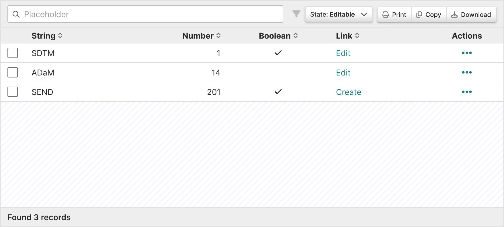
Native HTML table element
Section titled “Native HTML table element”
Section titled “In practice”Tables should:
Section titled “Tables should:”- Show values across multiple categories and measures.
- Allow for filtering and ordering when comparison is not a priority.
- Help users visualize and scan many values from an entire data set.
- Help user find other values in the data hierarchy through links.
- Use only relevant text or data so that it’s easy to understand.
- Wrap instead of truncate content. This is because if row titles start with the same word, they’ll all appear the same when truncated.
Alignment
Section titled “Alignment”- Column content types are built into the component props so the following alignment rules are followed:
- Numerical = right aligned
- Textual data = left aligned
- Icons = center align
- Align headers with their related data
Actions column
Section titled “Actions column”- Use links when there are one or two actions.
- Use an overflow menu, trigger by an ellipse icon (), when there are more than two actions.
- Place the column all the way to the right.
Section titled “Content guidelines”Headers should:
- Be informative and descriptive
- Be concise and scannable
- Include units of measurement so they aren’t repeated throughout the columns
- Use sentence case (first word capitalized, rest lowercase)
Column content should:
- Be concise and scannable
- Not include units of measurement (put those in the headers)
- Use sentence case (first word capitalized, rest lowercase)
Decimals
Section titled “Decimals”Keep decimals consistent. For example, don’t use 3 decimals in one row and 2 in others.
Section titled “Accessibility”Structure
Section titled “Structure”- Native HTML tables provide a large amount of structural information to screen reader users. Users who rely on screen readers can navigate tables and identify relationships between data cells
tdand headersthusing keys specific to their screen reader. - Sortable tables use the aria-sort attribute to convey which columns are sortable (and in what direction). They also use aria-label on sorting buttons to convey what activating the button will do.
Keyboard support
Section titled “Keyboard support”Sorting controls for tables are implemented with native HTML buttons.
- Give buttons keyboard focus with the tab key (or shift + tab when tabbing backwards)
- Activate buttons with the enter/return and space keys
Section titled “Design resources”When designing tables in Certara’s Design Library, use plugin Table Creator