
State Management: Inactive states
Every control needs a plan for when it cannot be used. Users do not guess why a control is inactive. Tell them the problem and how to fix it, right where they can see it.
Inactive is the term for any control the user cannot use the way it normally works. It covers three specific states:
- Disabled
- Read-only
- Hidden
Each state gets its own explanation in the sections below.
The problem with disabling
Section titled “The problem with disabling”A greyed-out control tells the user something is disabled. It does not tell them what caused it, or how to fix it. That gap is the real problem, not the disabling itself.
Always show the reason and the fix in the visible content, not behind a hover or a tooltip. Disabled controls are usually removed from the keyboard tab order, so anyone navigating by keyboard, screen reader, or switch device cannot reach a tooltip at all. A hover-only tooltip only reaches a sighted mouse user, which is a small slice of who needs the explanation.
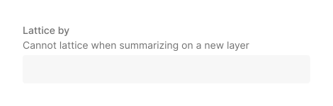
Do
State the reason where the user can already see it.
Don‘t
Hide the reason behind a hover or tooltip.Four ways to handle an inactive control
Section titled “Four ways to handle an inactive control”Every option here is really doing the same thing: putting feedback where the user is already looking, at the moment they need it. Pick whichever version of that fits the situation. None of these is the default for a specific type of control.
- Keep it enabled (Preferred). Explain what happened when the user tries it. Best for buttons, tabs, and menu items whose result depends on what the user selected. Use a popover for buttons and tabs. Use a toast for menu items, since the menu closes before a popover has anything to point at.
- Disable it. Explain the reason right there. Best when the condition could still change.
- Show the value as read-only text. Remove the control. State the value, and why it cannot change if that is not obvious. Best when the value is permanent, or, for a radio group, when disabling the options that do not apply would leave no real choice behind.
- Hide it. Remove the control from view. Best when the control doesn’t apply here at all, whether that’s about who the user is (a permission or role) or where they are (a mode or configuration where the feature doesn’t exist).
Choosing between disabling and read-only text
Section titled “Choosing between disabling and read-only text”Ask one question: is this permanent?
If the value is fixed by an object’s type, a role, or a permission, and nothing the user does will ever change it, show read-only text. A control that will never work should never look like something the user can select. Do not just mute its color, since that still invites a click. Note: this is different from hiding it. Read-only text still shows the value, because the value is worth knowing. Hiding removes the control entirely, because it has nothing to do with this user or this context.
Read-only text has a second advantage worth knowing, even outside the permanent case: it does not look interactive, and it needs nothing announced to a screen reader, it is just text stating a value. A disabled control still has to communicate “this exists, you cannot use it, and here is why” to every user, including screen reader users. Read-only text skips that.
Radio groups get an additional test beyond permanence, since disabling one option can remove a real choice even when the condition is temporary. See Radio groups below.
Read-only
Do
Remove the control. Show the value as plain text.Disabled
Don‘t
Disable the UI and look like the user could enable it.Buttons and tabs
Section titled “Buttons and tabs”Keep the button or tab enabled. When the user selects it and the action cannot complete, show a popover with what happened, why, and how to fix it. Trigger the popover on select or focus, not hover alone, so keyboard users can reach it too.
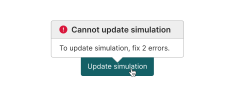
Do
Keep the button enabled. On select, show a popover that explains why the action is unavailable and how to reactivate it.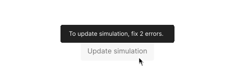
Don‘t
Disable the button and rely on a tooptip, since a tooltip on a disabled control is not reachable by keyboard or screen reader.Buttons that show progress
Section titled “Buttons that show progress”Some actions run in steps: idle, in progress, done. Disabling for that short window is fine, since the label and icon already say what is happening.
- Save (enabled)
- Saving (disabled, spinner icon)
- Saved (disabled, checkmark icon)
The button returns to “Save” as soon as the user makes another change.
Menu items
Section titled “Menu items”Three situations, three treatments, and only two of them are actually disabled.
- Disabled, one item. The reason is known while the menu is open. Keep the label. Add a line of text below it.
Do
State the reason where the user can already see it.Don‘t
Disable the button without displaying a reason.- Disabled, the whole menu. No items apply yet. Replace the whole menu with one message instead of disabling every item one by one.
Do
Replace the whole menu with one message instead of disabling every item one by one.- Not disabled, kept enabled. The item usually works, but might fail depending on what is selected. Keep it enabled. Show a toast if it fails.
Do
Keep it enabled. Show a toast if it fails.How to decide between disabling this item and keeping it enabled with a toast:
Section titled “How to decide between disabling this item and keeping it enabled with a toast:”- Is a short explanation enough? Disable the item in place with inline text.
- Does the explanation need more room than the menu has? Keep the item enabled and use a toast instead.
- Is a toast faster to build than a popover here? That is a legitimate reason on its own. A popover needs an anchor, and a menu item is about to disappear the moment it is clicked.
Switches and checkboxes
Section titled “Switches and checkboxes”Add a line of text below the toggle. State why it is off and what turns it back on.
Do
Add help text to a disabled switch explaining why it's disabled.Don‘t
Disable the switch without any help text explaining why and how to enable it.If it can never be turned on for this object, because of its type, a role, or a permission, that is the permanent case, see Choosing between disabling and read-only text above. Show the value as read-only text instead of a disabled control.
Radio groups
Section titled “Radio groups”Start here: after disabling the options that do not apply, how many options can the user still pick?
One or none. There is no real choice left. Showing a radio group implies the user is picking between options, but there is nothing left to pick between. Remove the group and show the value as read-only text instead.
Read-only
Do
Remove the control. Show the value as plain text.Disabled
Don‘t
Disable the UI and look like the user could enable it.Two or more. A real choice still exists. Keep the radio group, disable just the option that does not apply, and explain it inline, following the disable in place pattern above.
Disabled with reason
Do
Remove the control. Show the value as plain text.Disabled without reason
Don‘t
Disable the UI and look like the user could enable it.Spreadsheet
Section titled “Spreadsheet”A blank disabled cell may read as a bug, not an intentional state. Stating the reason confirms it is expected, explains why the cell is inactive, and points to how to change it if that is possible.
Do
Disable with an explanation.Don‘t
An empty, shaded cell with no text.Entire spreadsheet
Section titled “Entire spreadsheet”If the whole table is permanently locked, apply the read-only style across the whole spreadsheet and add one line above it stating why: “Read-only: viewing a published dataset.” Do not repeat “does not apply” in every cell, since that implies a table that is selectively editable, when nothing in it is.
When to hide instead of disable
Section titled “When to hide instead of disable”Ask: does this control apply here at all? If no, hide it. If it applies but the value can’t change, that’s the read-only case above, not this one.
Hide for:
- Who the user is: a permission they don’t have, a role they’re not in
- Where they are: a feature that doesn’t exist in this mode
Disable, and explain, when a condition might change: more input, a status update, a data update.
Accessibility checklist
Section titled “Accessibility checklist”This applies to any disabled control on this page, not only the examples above.
- Keep controls focusable. Use aria-disabled instead of the native disabled attribute, so keyboard and screen reader users can still reach the control.
- Give every disabled control an accessible name that matches its visible reason.
- Avoid pointer-events: none. It blocks clicks but not keyboard focus.
- Test with a keyboard only, and with a screen reader. A tooltip-only explanation passes a quick look and fails both tests.